Typography Basics: How to Choose the Perfect Font Pairing
Typography is more than just picking pretty fonts. It’s about creating harmony and readability that guides your users through your website effortlessly. Let’s dive into the essentials!
What is Typography, and Why Does It Matter?
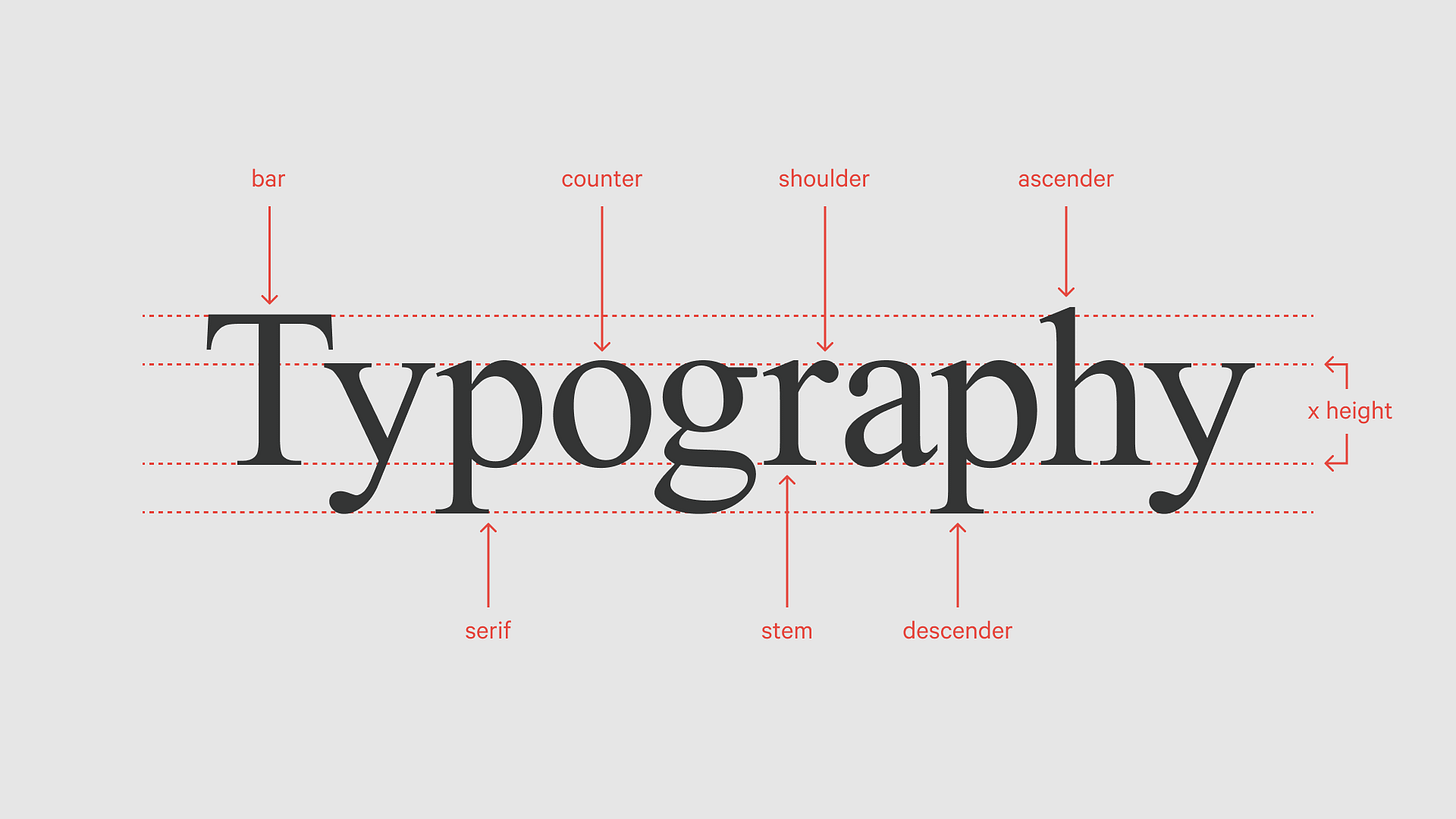
Typography is the art of arranging text. It includes font styles, sizes, spacing, and how everything works together on a page.
Why it’s important: Good typography makes your website easy to read and visually appealing.
Bad typography: Imagine using Comic Sans for a law firm—it instantly sends the wrong message!
Great typography builds trust, boosts usability, and even sets the tone for your brand.
Step 1: Start with a Primary Font
Your primary font is like the main character of a story—it carries most of the weight.
Pick a readable font: Sans-serif fonts like Roboto or Open Sans work well for digital content. They’re clean, modern, and easy on the eyes.
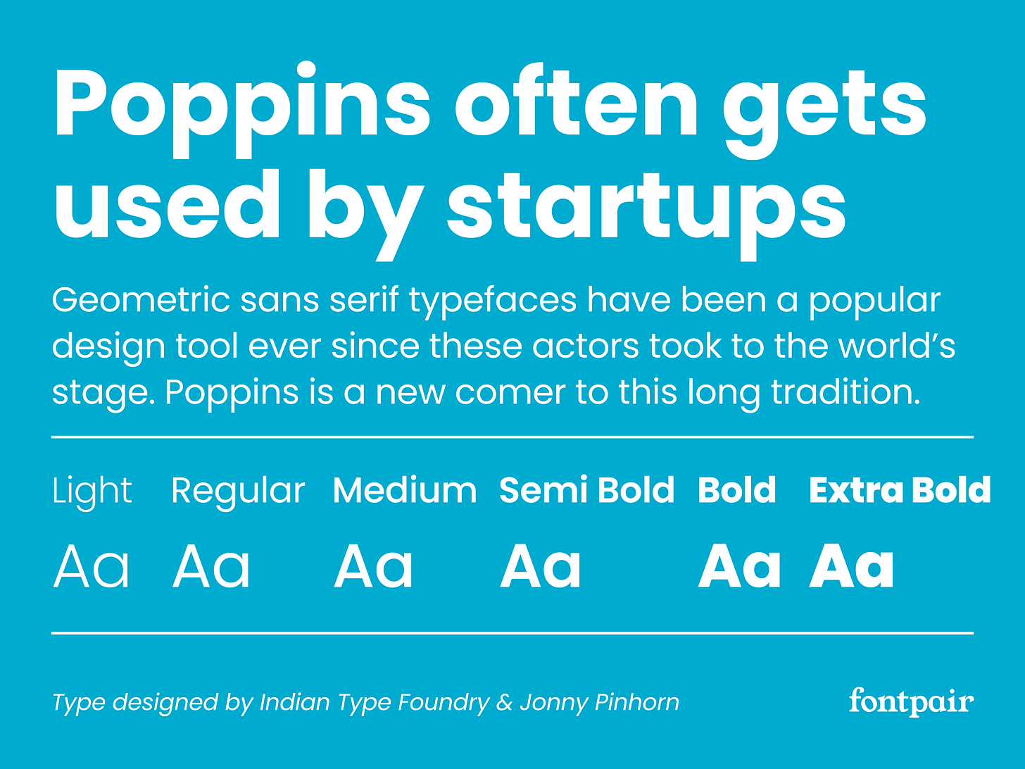
Match your vibe: If your website is playful, try something fun like Poppins. For a serious tone, go with classics like Georgia or Merriweather.
Step 2: Find a Complementary Secondary Font
This is where you add depth and contrast. Your secondary font is typically used for headings or accent text.
Go for contrast: Pair a sans-serif font like Roboto with a serif font like Playfair Display to create balance.
Stick to two fonts max: Too many fonts can make your design look messy.
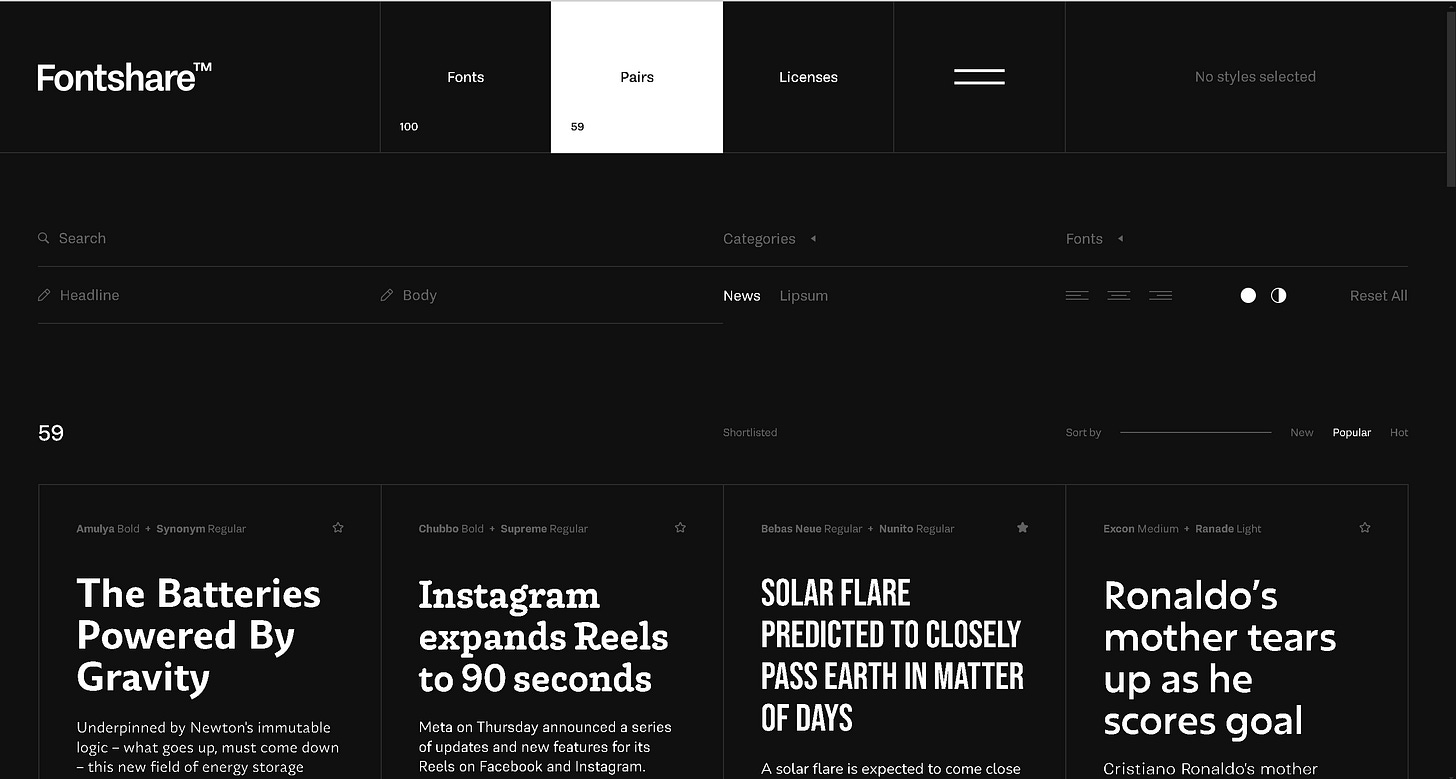
💡 Free tool to explore font pairings: Google Fonts | Fontshare
Step 3: Play with Hierarchy
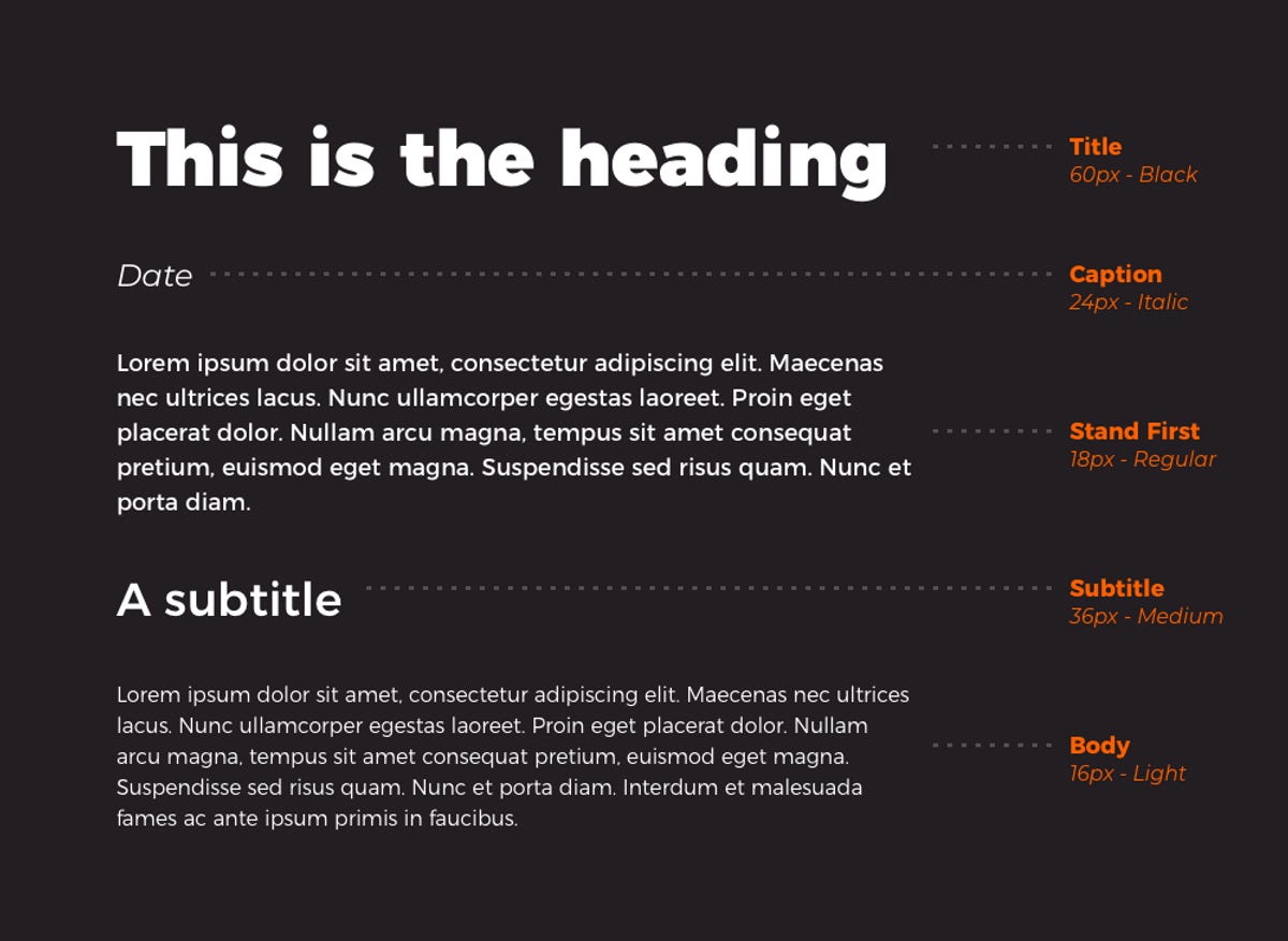
Hierarchy helps guide the reader's eye to the most important parts of your page.
Use size strategically: Make headings larger than body text so users know where to start.
Experiment with weight: Bold fonts can emphasize key points, while lighter weights are great for longer text.
For example:
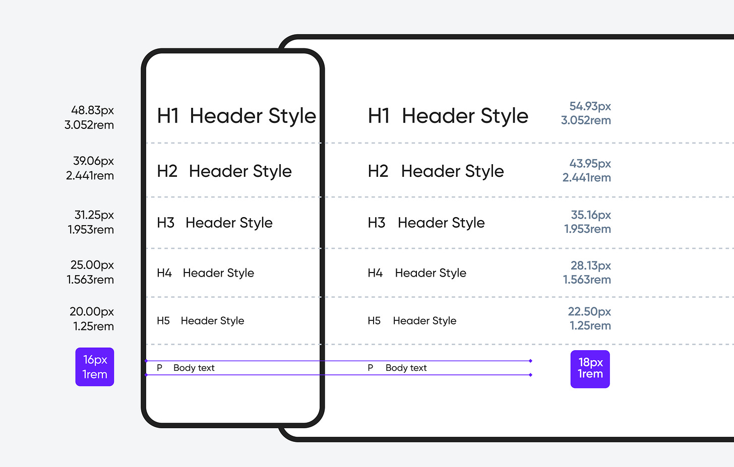
Heading (H1): Bold, 32px
Subheading (H2): Medium, 24px
Body Text: Regular, 16px
Step 4: Consider Line Spacing and Alignment
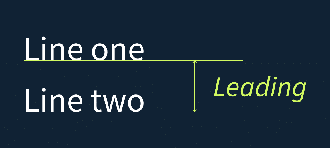
Line spacing (also called leading) and alignment can make or break readability.
Line spacing: A good rule of thumb is 1.5 times the font size. For example, if your font is 16px, aim for 24px spacing.
Alignment: Left-align body text—it’s easier to read on screens. Avoid fully justified text as it can create awkward spaces.
Step 5: Test on Different Devices
Typography can look great on your laptop but might fail on a mobile screen. Always test!
Check for font sizes: Is the body text readable without zooming in?
Test for consistency: Does your font style look the same across devices?
Bonus Tips for Typography Success
Avoid overcrowding: Leave enough white space around your text for a clean look.
Be mindful of accessibility: Use colors with good contrast. Tools like Contrast Checker can help.
Don’t skip previews: Tools like Figma or Adobe XD let you see how fonts look in action.
Wrapping It Up
Typography is a powerful tool that can make or break your website. Start simple—choose one or two fonts that fit your style, focus on readability, and test your design across devices.
Typography isn’t just a detail; it’s a major player in creating great web experiences. What fonts do you love using? Share your favorites in the comments below!


